Publishing Results
Click here to find out how to optimise dSNAP and PolySNAP graphics displays for publication.
Compare programs
Click here for an overview comparing dSNAP, PolySNAP and PolySNAP M.


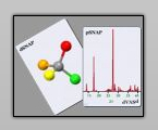
SNAP software is developed by the
Theoretical Crystallography group at the University of Glasgow, and is
exclusively distributed by Bruker AXS.
PolySNAP Worked Example
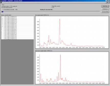
To begin the analysis the data files are read into PolySNAP as shown in Fig. 1a.
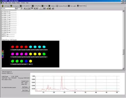
Once this is done the patterns are matched against each other, and the
results cluster-analysed to assign them into groups of similar
patterns. This information is initially represented by the colour
coding in the cell display (Fig. 1b).
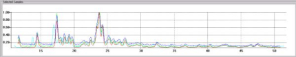
The pattern profiles are displayed at the bottom of the screen and multiple profiles can be compared simultaneously as shown below in Fig. 1c.
When previously identified known phases are provided PolySNAP can decide whether a pattern is an already known sample, a mixture of known samples, or something completely different. Fig. 2a displays the difference seen in the cell display when known phases are included and Fig. 2b highlights the two patterns assigned as being mixtures.
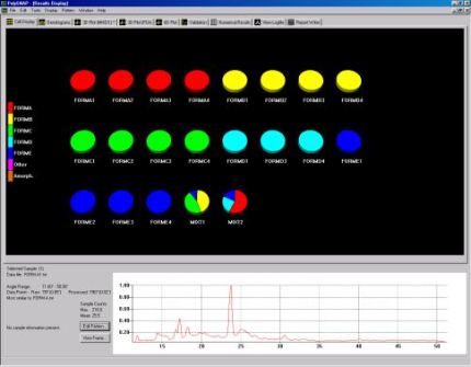
Fig. 1a - The process of inputting data into PolySNAP.
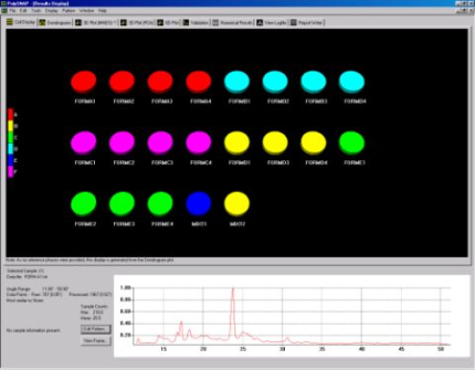
Fig. 1b - The cell display.
Fig. 1b - The cell display.
The pattern profiles are displayed at the bottom of the screen and multiple profiles can be compared simultaneously as shown below in Fig. 1c.
Fig. 1c - overlaying several pattern profiles for comparison.
When previously identified known phases are provided PolySNAP can decide whether a pattern is an already known sample, a mixture of known samples, or something completely different. Fig. 2a displays the difference seen in the cell display when known phases are included and Fig. 2b highlights the two patterns assigned as being mixtures.
Fig. 2a - the cell display with known phases included.
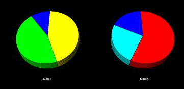
Fig. 2b - The mixture cells.
Fig. 2b - The mixture cells.
The mixture cells are displayed as pie charts displaying the amount of each phase calculated to be in the mixture.
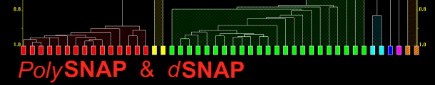
In addition to cell display there are other graphical outputs for results, including the dendrogram (Fig. 3a) and two varieties of 3D plot (Fig. 3b).
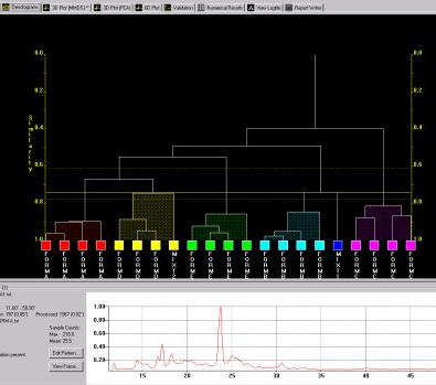
Both display the calculated level of similarity. The dendrogram does this through a tree diagram - the lower on the similarity scale two patterns (coloured boxes) are joined by a horizontal tie-bar, the more similar the fragments are - while on the 3D plot each sphere represents a pattern, and the further apart two points are, the more different the corresponding patterns are. As a result, similar samples can be seen to ‘clump’ together into clusters. Very similar patterns produce tight clusters, whereas less identical ones give more diffuse groupings. The user is therefore able to tell at a glance quite a lot about the patterns being grouped together by the program, and any outliers are easily spotted. The colours are taken from the dendrogram display, allowing comparison of the results from the two separate analysis methods.
The results suggest this data set is made up of 5 separate polymorphic forms, and two mixtures of two or more pure phases.
 Once
analysis is complete there is an option to automatically generate a
report including screenshots from the various graphics displays.
Once
analysis is complete there is an option to automatically generate a
report including screenshots from the various graphics displays.
In addition to cell display there are other graphical outputs for results, including the dendrogram (Fig. 3a) and two varieties of 3D plot (Fig. 3b).
Fig. 3a - the dendrogram.
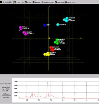
Fig. 3b - one of the 3D plots.
Fig. 3b - one of the 3D plots.
Both display the calculated level of similarity. The dendrogram does this through a tree diagram - the lower on the similarity scale two patterns (coloured boxes) are joined by a horizontal tie-bar, the more similar the fragments are - while on the 3D plot each sphere represents a pattern, and the further apart two points are, the more different the corresponding patterns are. As a result, similar samples can be seen to ‘clump’ together into clusters. Very similar patterns produce tight clusters, whereas less identical ones give more diffuse groupings. The user is therefore able to tell at a glance quite a lot about the patterns being grouped together by the program, and any outliers are easily spotted. The colours are taken from the dendrogram display, allowing comparison of the results from the two separate analysis methods.
The results suggest this data set is made up of 5 separate polymorphic forms, and two mixtures of two or more pure phases.